Design notes / 31 October 2026

Timing through
interruptions.

Rounding a reading should not change the time being kept.

31 October 2026 / Redesign note

Case, surface
and lettering.

Profile 31 revises the Barrister’s crystal shoulder, lower case return, lug profile and crown mark. The wordmark has been corrected after the S was found to stand about 16% taller than the T. The 39 mm case, 45 mm lug span, 20 mm strap opening and 28 printed dial marks remain.

The current capture contains 19 valid positive solids. Its 12.2 mm donor-reference exterior excludes the unknown custom-module height. The redesign is available for review; it has not been accepted as a finished design or built as a working mechanical watch.

The earlier Ivory, Ink and Silver appearance was rejected and withdrawn. Its design notes and development record remain preserved.

See the current Barrister

A task can occupy an afternoon without taking all of it. You start, stop for something else, then return. The Barrister is being developed to keep that active time together and show the accumulated total in hours and six-minute units.

The distinction is what the timer remembers. Stop at eight minutes and twenty-four seconds and the intended display shows two tenths of an hour. Resume and the retained eight minutes and twenty-four seconds returns. The rounded reading has not replaced the original time.

Pauses do not become separate rounded entries. When stopped, the accumulated total rounds up to a six-minute unit. An exact six-minute boundary stays unchanged.

Hours and tenths also carry together. Fifty-nine minutes and one second becomes one hour and zero tenths when stopped. Resume and timing continues from the retained fifty-nine minutes and one second.

This behaviour works in the software study. The physical mechanical module has not been built. Its transmission, rounding and retention remain unresolved.

The dial has to make the distinction readable. Its registers need enough presence to show elapsed time without obscuring the time of day. A large image is useful for examining details; the lettering also needs to be judged at its actual size within the case.

How the timing works
Earlier Ivory study / Withdrawn

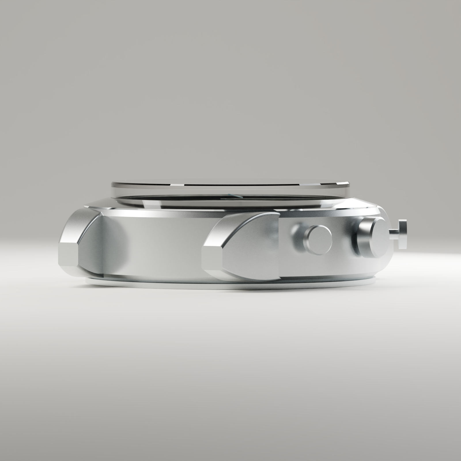
Case profile
and controls

Historical profile of the withdrawn Ivory Barrister study, showing its broad case flank and exposed pusher stems
Historical Ivory render · Appearance rejected and withdrawn

The earlier side view exposed a broad case flank and substantial lug roots. Its crystal, bezel and back created several layers, but the middle still gave the watch a heavy appearance.

The exposed pusher stems looked slight beside that mass. This was a question of visual proportion; the image supplied no evidence of their physical strength or feel.

That withdrawn study had a 13.1 mm donor-reference exterior, excluding unknown custom-module height. It is historical evidence, not the current Profile 31 design. See the revised case and profile.

Decisions to test

Reading, wearing
and making

  1. Read both displays at actual size.

    Test ordinary time and elapsed time at several hand positions.

  2. Judge the complete watch.

    Compare front, oblique and profile views together, with a plausible strap.

  3. Resolve the case in section.

    Consider wall, crystal, bezel and back together. Perceived mass and measured height are different questions.

  4. Connect lugs, strap and controls.

    Study the lug transition, strap articulation, crown and pushers as one composition.

  5. Adapt the lettering to its role.

    Develop antique forms separately for hour figures, register figures and signatures.

  6. Change the light.

    Test metallic marks across lighting conditions, including the weak applied 12 and 6 in the withdrawn Ink study.

  7. Set the hierarchy before adding decoration.

    Compare spacing and visual weight before introducing texture or ornament.

  8. Qualify the actual processes.

    Test printing and applied components before claiming craft, finish quality or durability.

Lettering and production

Forms shaped
for a dial

The founder’s preference is for strong antique letterforms without artificial distress. The current study uses original letterforms drawn for its numerals and signatures. They remain under review. Widths, stroke relationships and spacing need to work for each dial role. anOrdain’s account of dial lettering

Pad printing transfers ink from engraved artwork through a silicone pad. That process is distinct from making and attaching a raised numeral. Neither a clean vector outline nor a valid CAD solid qualifies the finished part. anOrdain’s dial-printing process

Bauhaus teaching offers a useful method of examining form, size, colour and production together. It supplies no ready-made style for this watch. Historical Bauhaus publications also used roman serifs alongside sans-serif faces. Joost Schmidt’s lettering teaching Letterform Archive’s historical specimens

Read the development record